
UX Case Study
Bluetip
Exploratory project for DESIGNATION to create an online crowdfunding platform for investing in start-ups.
Background
The U.S. Securities and Exchange Commission voted in October, 2015 to approve rules governing the sale of securities through online equity crowdfunding. With the new rules (collectively known as Regulation Crowdfunding), small and medium-sized start-ups can now raise capital for their enterprises by offering equity to anyone, rich or poor, accredited or unaccredited. This is great news for companies that have limited access to high net worth investors and institutions like venture capital firms.
Under the new rules, small businesses and startups would be able to solicit up to $1 million annually in crowdfunded securities investments.
Problem Statement
People with small amounts of disposable income want to find ways to make their money grow, but traditional investments can be intimidating and impersonal to those just starting out. Startup equity is a great emerging investment opportunity for the everyday person, with opportunities for significant financial and emotional returns.
In the US, three businesses are launched and $1,532 of venture capital is invested every second. That adds up to $48.3 billion annually. This means that startups can now pursue small-scale crowdfunding for initial investment rounds, rather than large singular investments traditionally supplied by the accredited investor. With this sea change in investing anyone with a bank account can buy equity shares in the next Uber, Pinterest, or Airbnb.
How do we create a investing platform that embodies this newly-broken barrier for entry while being fun, exciting and easy-to-use?
Potential investors need a way to get informed and discover businesses they can invest in. There must be a low barrier to entry, both in terms of cost/effort and in terms of domain knowledge.
Empathize & Define
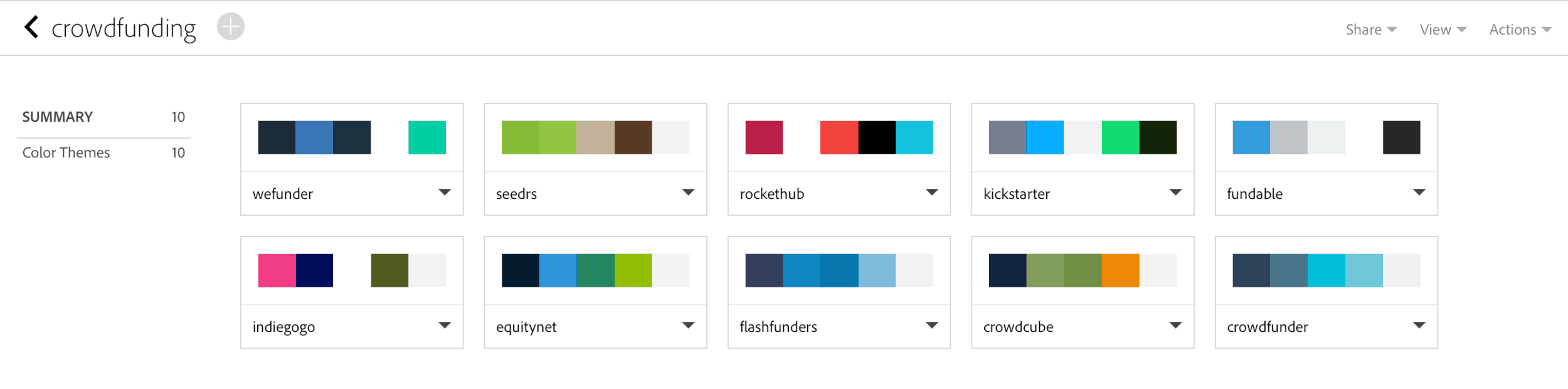
Our team began a short period of intensive research into crowdfunding and equity investing. We defined key terms — equity, dilution, valuation, shares, IPO, accreditation — to better understand the investing space. We looked at various online platforms, including ten of the leading equity and/or crowdfunding sites: Kickstarter, Fundable, Crowdcube, Seedrs, Crowdfunder, EquityNet, Wefunder, Indie Go-Go, RocketHub, and Flashfunder, examining each for content, voice, and design.
Across the ten sites we analyzed, there were several commonalities: a predominantly blue color palette (symbolizing stability and trustworthiness) with warm accent colors in pink and orange [red was largely avoided because of its association with danger and–more specifically–unprofitability], large homepage imagery and (with the exception of crowdfunding outlier Kickstarter) a serious, business-like tone aimed directly at the accredited investor audience.
Qualitative Data: Interviews
Following this domain research, we conducted interviews with nine individuals—representing both investors (5) and entrepreneurs (4)—across a variety of disciplines, which led to insights into financial habits, aptitudes for both investing and seeking investment, and attitudes about traditional saving vs. high-risk investing.
Quantitative Data: Surveys
A brief survey about saving, investing, and crowdfunding was sent to the nine interviewees and subsequently to friends and colleagues. We received 31 completed responses, which deepened our insights:
58.1% 24-34 years old
45.2% $0-55,000 annual household income
92.3% contribute to savings accounts
65.4% contribute to retirement fund
43.3% are likely to support a business through crowdfunding
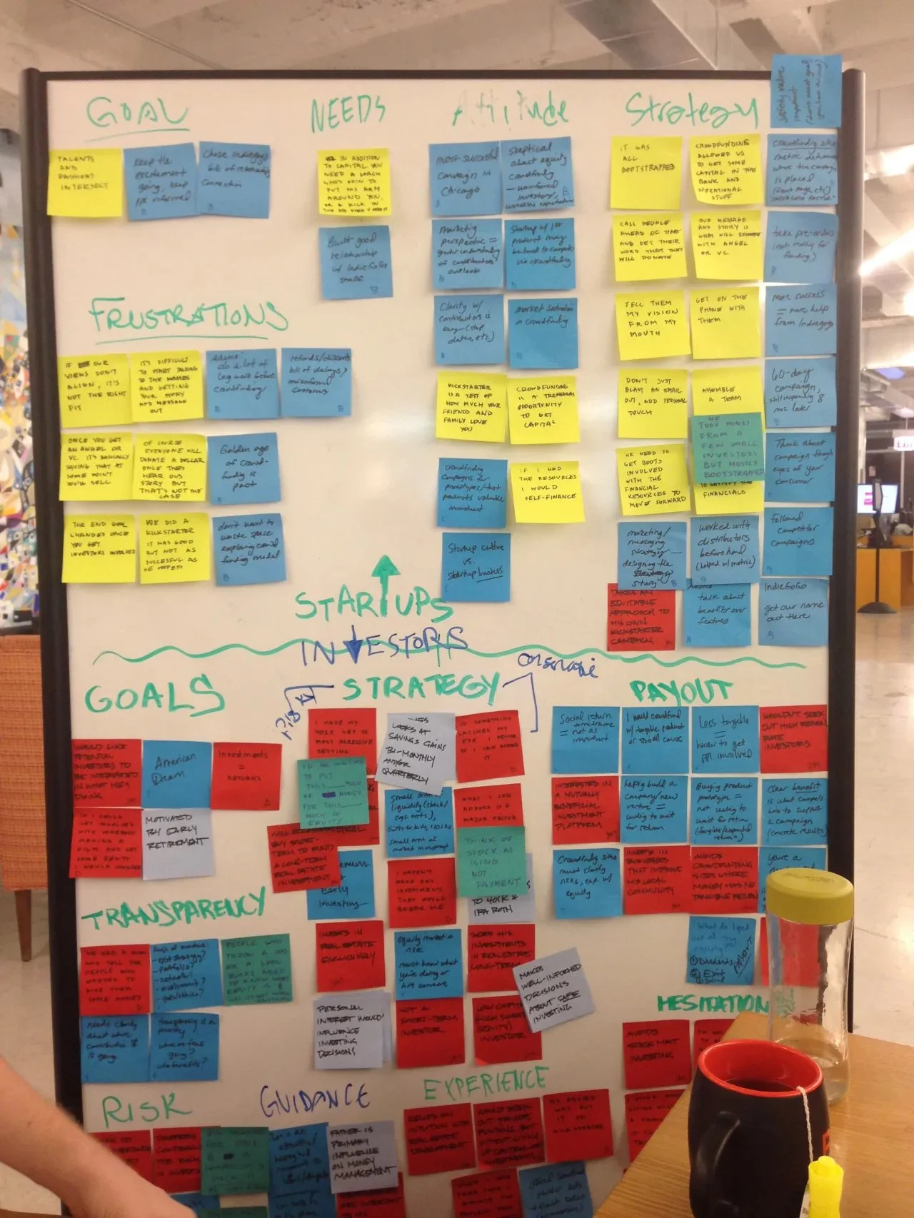
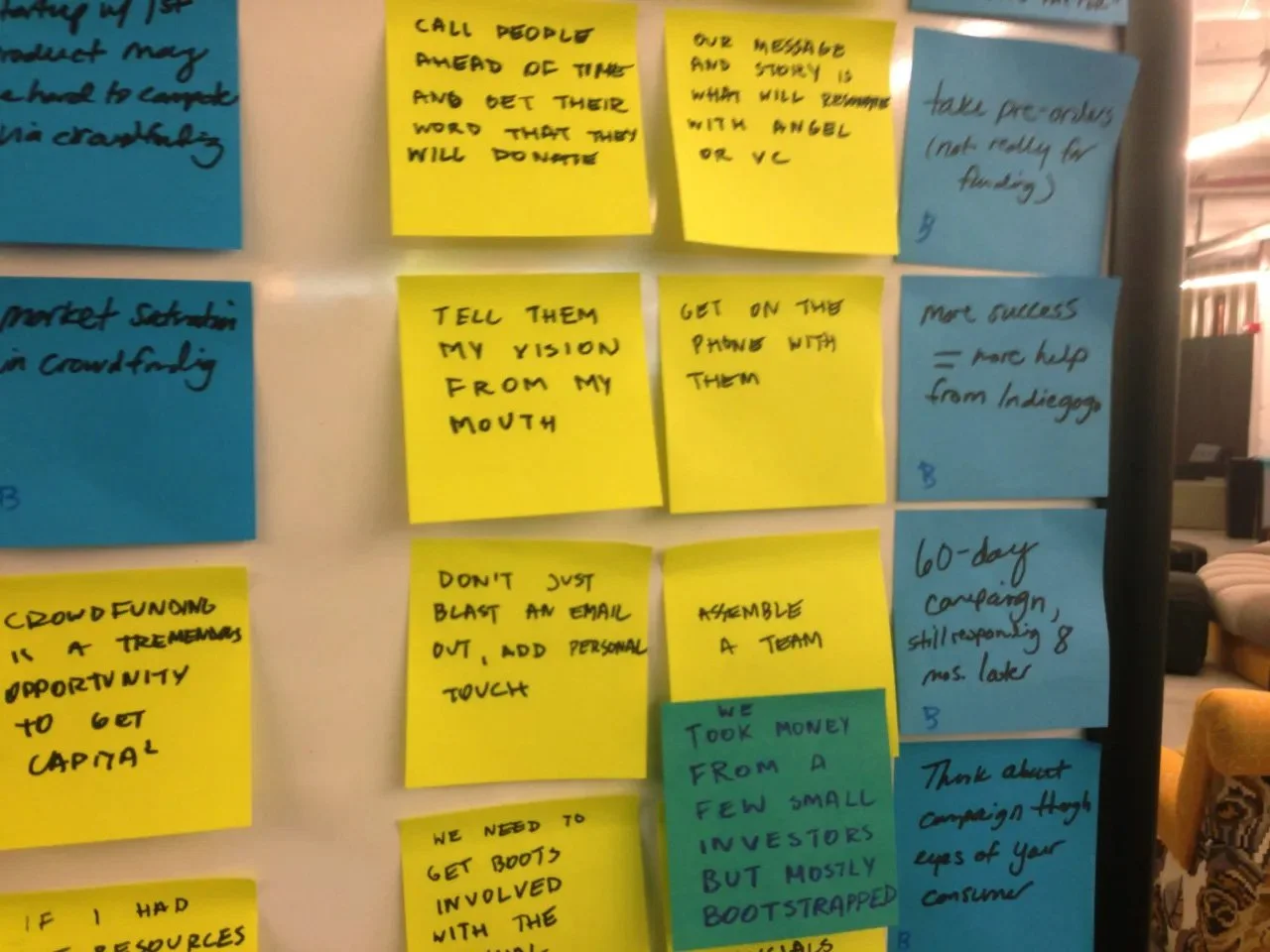
Synthesis
With the short, intensive research period completed, we synthesized our data, developed personas, and wrote both a problem statement and design principles.
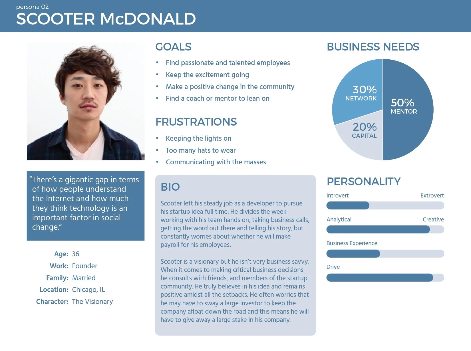
Through affinity diagramming, the team developed two personas, representing the investor and entrepreneur, respectively.
Our problem statement in part summarizes our domain research and defines the area for opportunity.
Our design principles summarize how to address the opportunity and are established criteria guiding the development of our product.
Personas
Bradley Jameson and Scooter McDonald are user composites of common goals, needs, and interests found in our research. Since the project prompt covered both sides of the investing transaction—the investor and the entrepreneur—this necessitated two unique personas, each with his own goals, current behavior, and pain points.
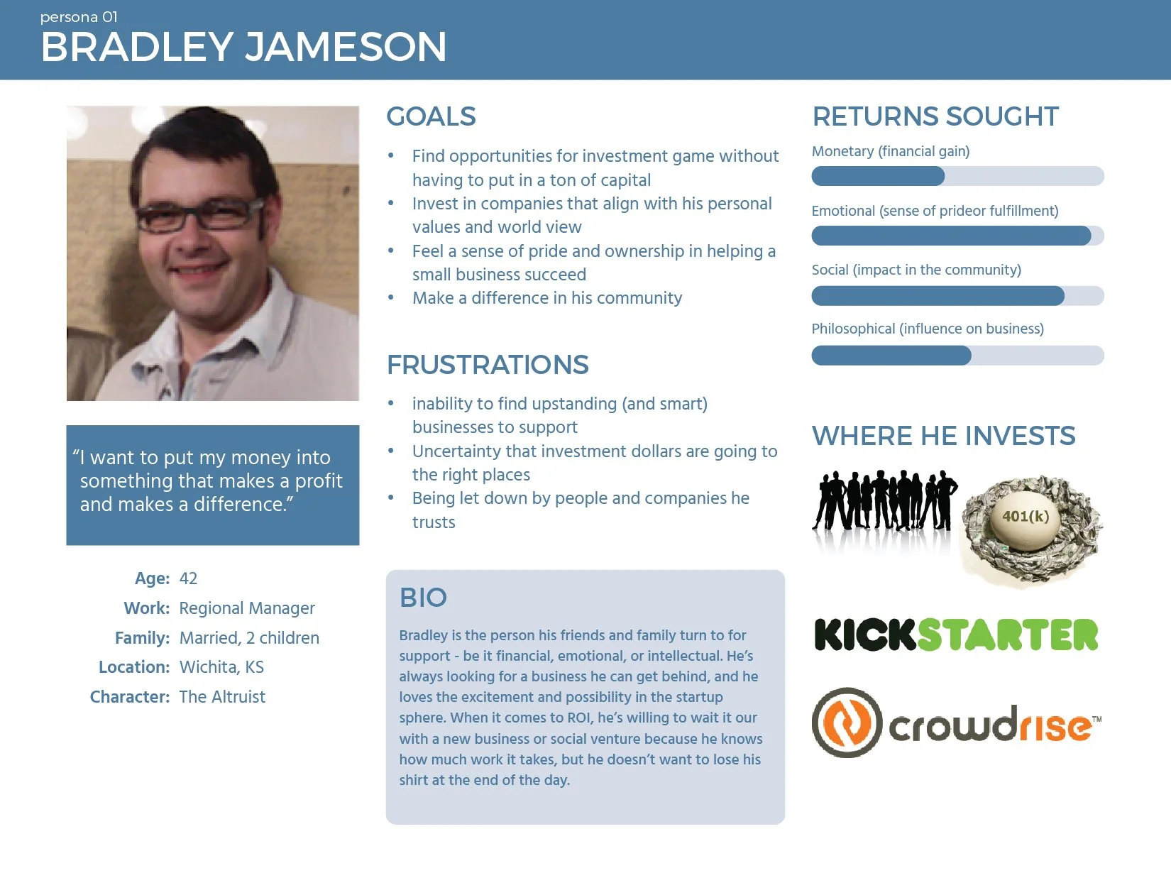
It was important for the team to have these fully-formed two end users as we moved forward to the development process. The team’s empathy for them and consideration of their goals and motivations would help define the functionality of our eventual end product.
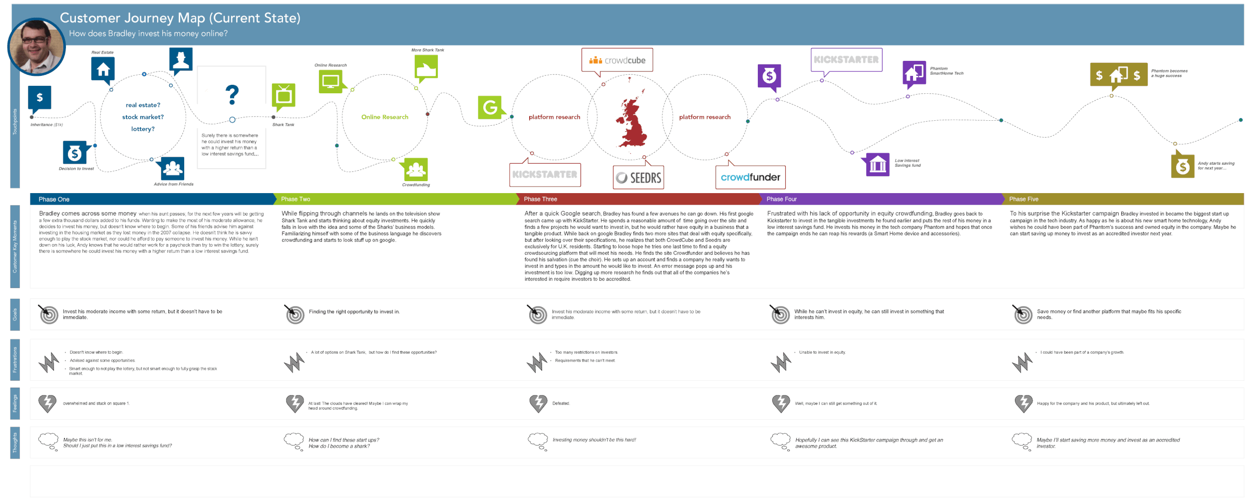
Journey Map (Current State)
An important artifact of our domain research was this user journey map, detailing our budding investor Bradley’s current goals and frustrations. This journey map also became a compelling story for our team, eventually driving our focus to the investor side of the transaction.
Where and how can Bradley invest his money online in a start up he believes in?
Becoming an accredited investor was a nearly-insurmountable barrier to entry. Discovering equity crowdfunding only accessible in the UK, Bradley was limited in the US to rewards-based investing via Kickstarter. He could only be materially rewarded for his financial support; there were no opportunities to grow his money.
Problem Statement
People with small amounts of disposable income want to find ways to make their money grow, but traditional investments can be intimidating and impersonal to those just starting out. Startup equity is a great emerging investment opportunity for the everyday person, with opportunities for significant financial and emotional returns. Potential investors need a way to get informed and discover businesses they can invest in. There must be a low barrier to entry, both in terms of cost/effort and in terms of domain knowledge. And the entire process should be facilitated through our platform.
Design Principles
Opportunity: Ability to seek out and discover emerging ideas and to get in on the ground floor.
Accessibility: Through a simple and inviting interface with easy-to-understand language, investors can contribute in small amounts.
Transparency: Startups and investors will have access to the information needed in order to feel secure in the relationships they build and the transactions they make.
Connection: The relationship between founder and investor is about more than money. Facilitate relationships based on shared goals, values, and expectations.
Ideation
Aside from Kickstarter, none of the platforms we looked at had a mobile version. This was perhaps our greatest insight and clearly the strongest area for opportunity.
Working with paper prototypes, the team equally contributed and iterated on the ideal user flow in the mobile app, with a focus on the investor side, which we felt was the primary benefactor of the SEC ruling.
Because the ruling had not yet gone into effect when we conducted our research, equity crowdfunding was largely unknown in the investing domain. Our interviews revealed that a majority of people approached the topic cautiously. We had to design an equity crowdfunding platform that was informationally transparent and accessible.
While Bradley was clearly our focus, we continued to look at both personas and thought of other mental models that fit their demographics. We came up with the our first concept: gamification. We would creatively represent the act of investing as a way to achieve points, status or more investment opportunity.
Our second concept was inspired by mental models both personas would already be familiar with: search engines, online dating (Tinder) and rewards-based crowdfunding (Kickstarter).
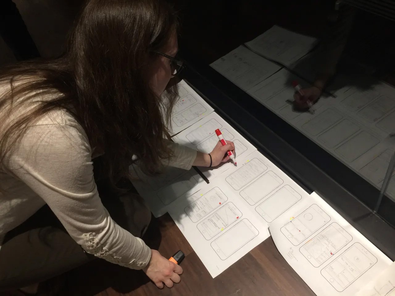
Low fidelity wireframes were user tested and we found our matching concept resonated more with users; they saw it easier for future investors to navigate and understand. With the gamification concept, users encountered multiple pain points (a direct correlation between money invested and achievement levels) that didn’t align with our design principle of accessibility. Even with small investment amounts, the concept felt unnecessarily gimmicky and didn’t inspire the trust our platform needed to establish. The concept simply didn’t resonate.
So we moved forward with mid-fidelity prototyping of our matching concept. These prototypes both validated this concept and drove us to pare down our app to the essentials: search investment opportunities that aligned with the user’s interests and subsequently make an in-app investment.
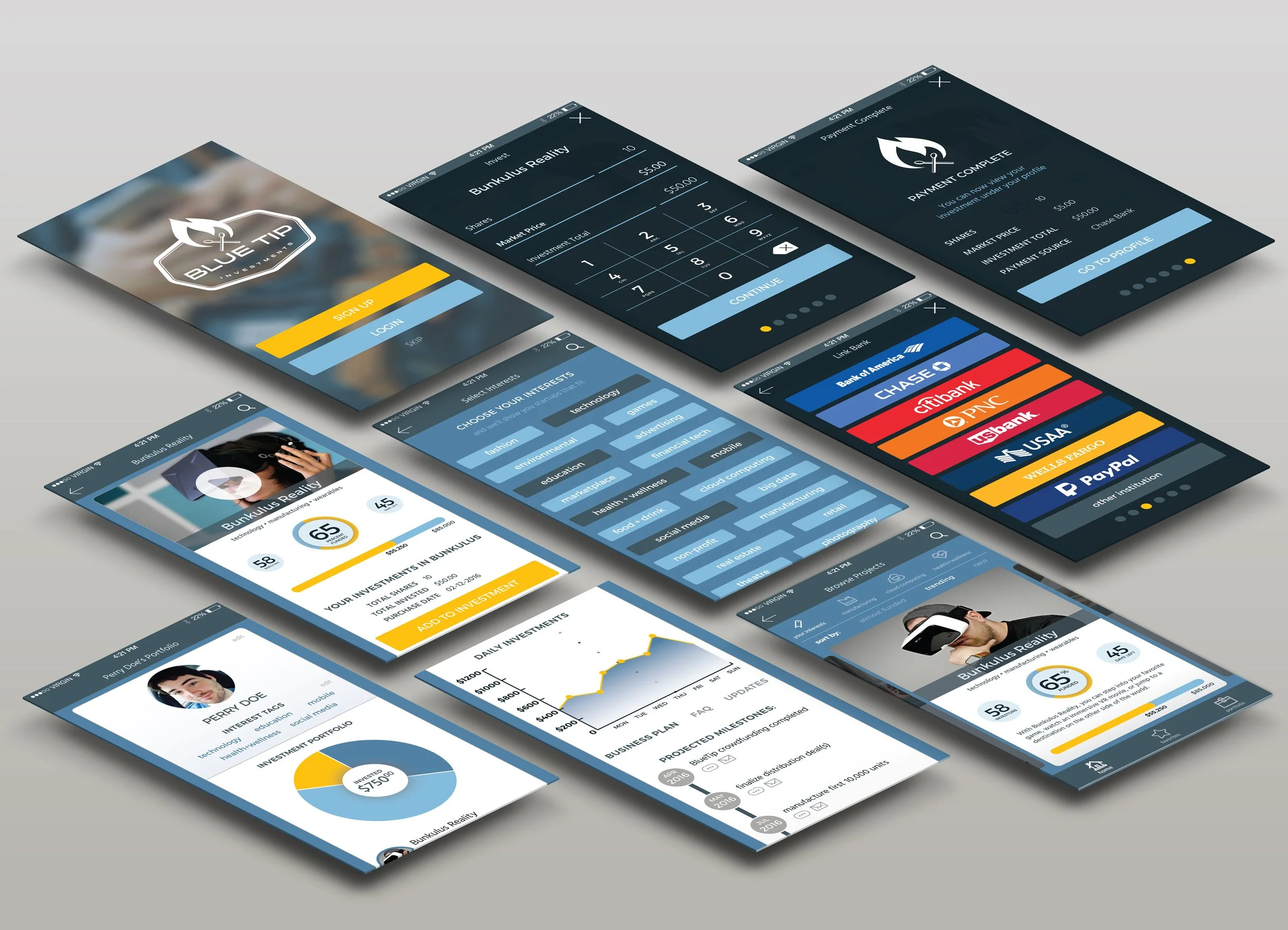
With our essentials in mind, we then fully mapped out the investor flow (represented in the wireframes below), with the goal of making the daunting process of investing as painless as possible. By moving the usually burdensome financial app onboarding to the investment transaction only, we allowed users to find start ups that fit their interests before creating an in-app account.
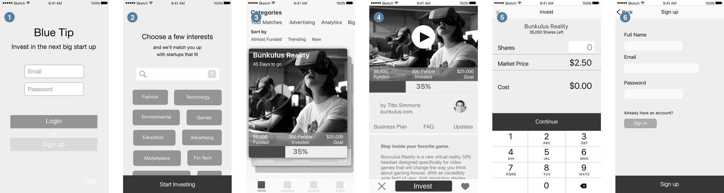
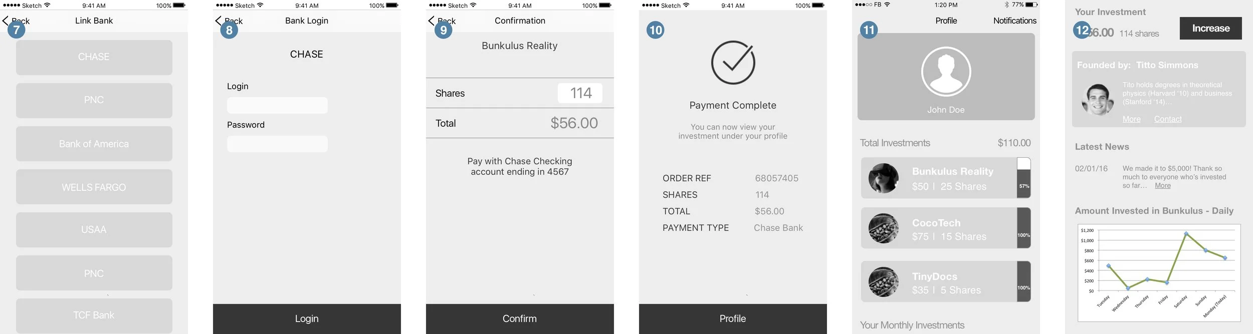
Mid-Fidelity Wireframes
The mid-fidelity wireframes seen below are a representation of our user-tested ideal investor flow, from sign-up (1) to investment search (3) to investment transaction (5) to resulting updated profile (11).
The full set of screens seen below are:
Welcome screen
Interest selection
Investment category
Start up details
Investing: specify shares
Investing: sign up
Investing: select financial institution
Investing: bank login
Investing: confirmation
Investing: transaction complete
Updated user profile
Post-investment start up details
User Testing & Prototyping
Visual Design
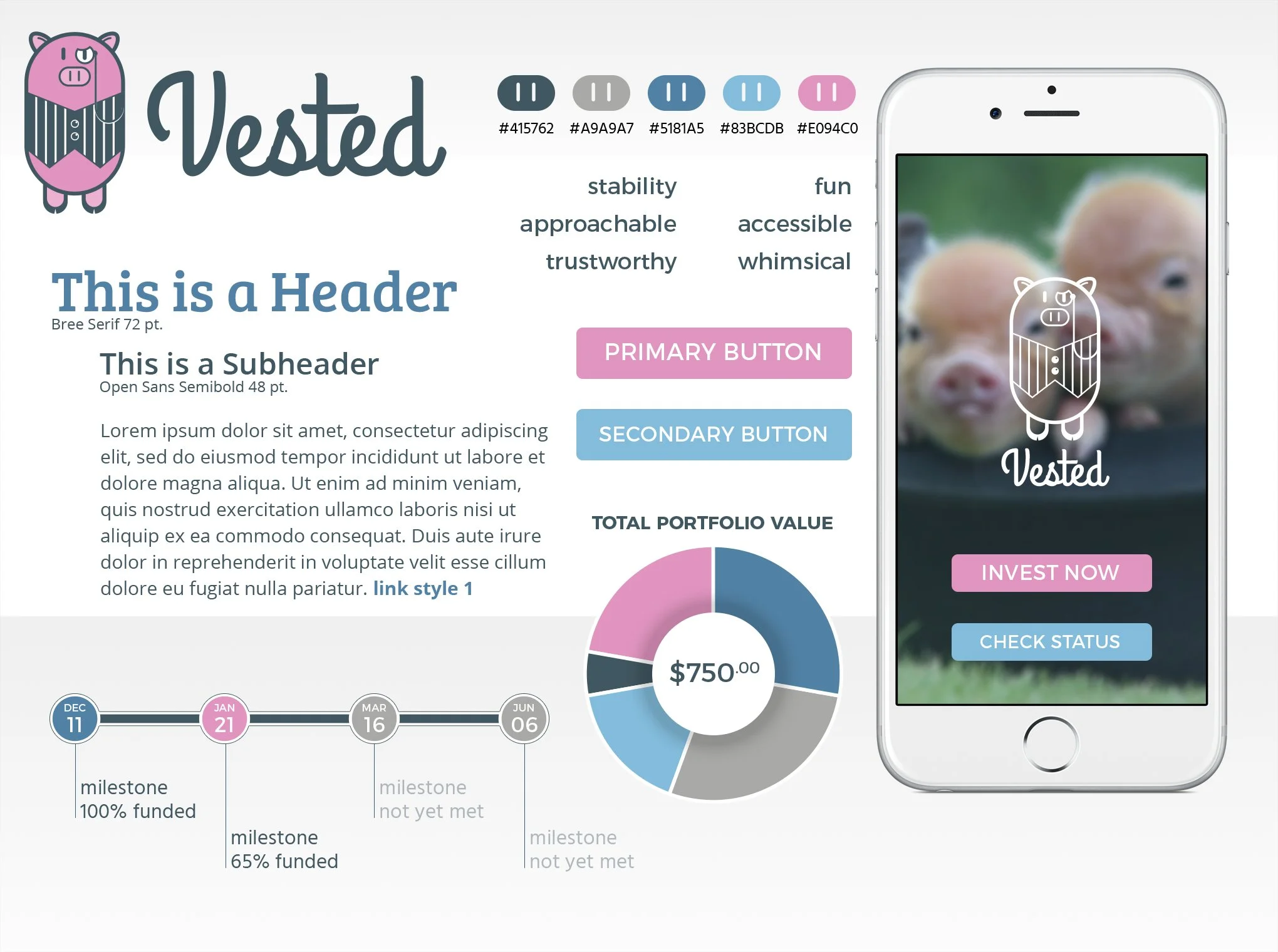
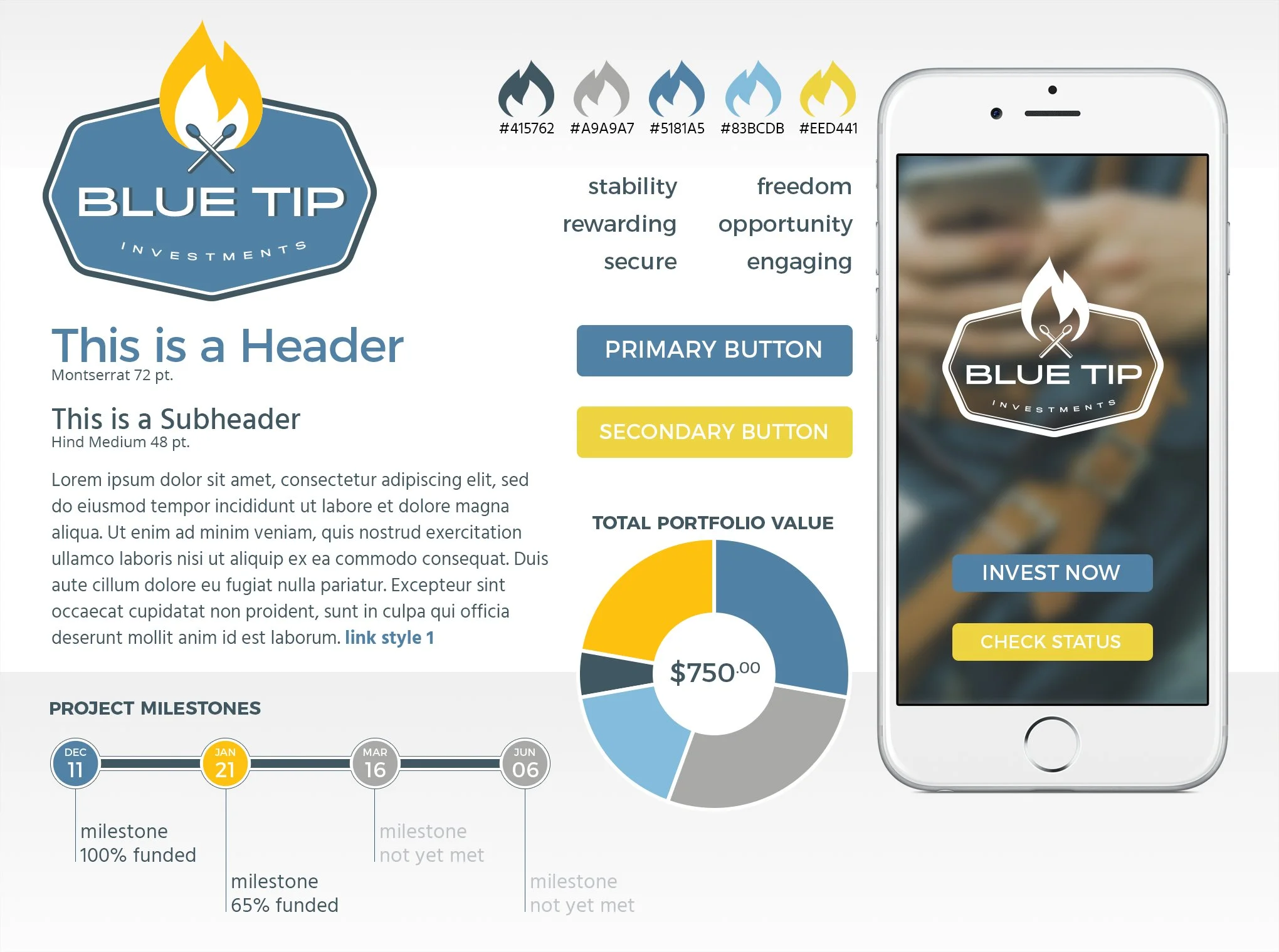
As lead UI designer on the project, I was tasked with establishing the visual language of our investing app. Working from the competitive analysis data, I knew the color palette had to evoke stability and reliability.
But to truly distinguish the app in this new investing marketplace and appeal to the target audience, the app needed to depart from the all-business tone of the existing investment space.
Design Exploration & Style Tiles
With Blue Tip I took a more literal approach to ‘matching’ (but clearly enough of a departure from the Tinder mental model), and made a secondary reference to stable ‘blue chip’ stocks. Subsequently, Blue Tip corresponded to the design principles of opportunity, accessibility, transparency, and connection.
With two very different concepts, style tiles were created for the two design directions. Both color palettes stayed within the aforementioned blue range representing stability. Vested incorporated a pink accent, corresponding to the monocled mascot. BlueTip incorporated an amber/orange, complementing the blue/grey and representing the fire of the lit matches (while avoiding the aforementioned taboo red).
The final high fidelity designs leverage the blue-dominated color palette and a tile design pattern, already very familiar to our target user, making the app easy to navigate and a pleasure to use.
Two distinctly different names and creative approaches emerged from brainstorming sessions: Vested and Blue Tip.
Vested came from having a ‘vested’ interest in a business or organization. After working through several abstract logo iterations to only modest success, I tried a different approach, using the other definition of the term vested and blended it with a variation on the familiar piggy bank. The distinguished but humorous ‘vested’ pig mascot showed immediate appeal and comfortably matched the design principles of accessibility and connection. But even so, the pig wasn’t quite an accurate representation of our validated matching concept.
Final Design
I gave particular attention to the design details of the investor flow, maintaining simplicity and transparency in an otherwise complex mobile transaction.
