UX Case Study
Watchtower Benefits
Service design for the non-medical employee benefits space.
Background
WatchTower is a SaaS technology start-up that seeks to modernize the Request for Proposal (RFP) process, specifically within the non-medical employee benefits space. “Centered on proprietary document extraction technology, [WatchTower’s] system captures the relevant information from insurance policy and proposal documents, allowing for an accurate, detailed plan analysis.”
Problem Statement
The corporate insurance benefit Request for Proposal (RFP) process is complicated and labor-intensive for insurance brokers.
Through complicated communications with multiple insurance providers, brokers are tasked with analyzing benefits for their clients.
Through an engagement with DESIGNATION, UX and UI were completed by small teams in two 2.5 week design sprints across overlapping cohorts. Building on a new UX foundation, my project team was tasked with UI, refining the look of WatchTower’s proprietary client-facing technology.
Competitive Analysis
Our team began a short period of research into the insurance brokerage space. To gain an understanding of the insurance domain (and service design in general), we looked at various insurance broker and health insurance platforms: Insly, Benefits Age, Cigna, Xuber, Lemme, The Hartford, and Progressive, examining each for content, voice, and design.
Across the platforms we analyzed, clarity of and accessibility to information was an important commonality. Design and style followed suit, always in a trustworthy mode, defined by predominantly blue and blue-green color palettes (signifying trustworthiness and reliability) with the occasional orange (often representing vitality and health).
Visual Design Process
Design Exploration & Style Tiles
Upon completing the research phase, we were tasked with individually developing three distinctly different style tiles. Since the design was of specific functionality of the WatchTower platform, we all utilized various platform components and styled them appropriately.
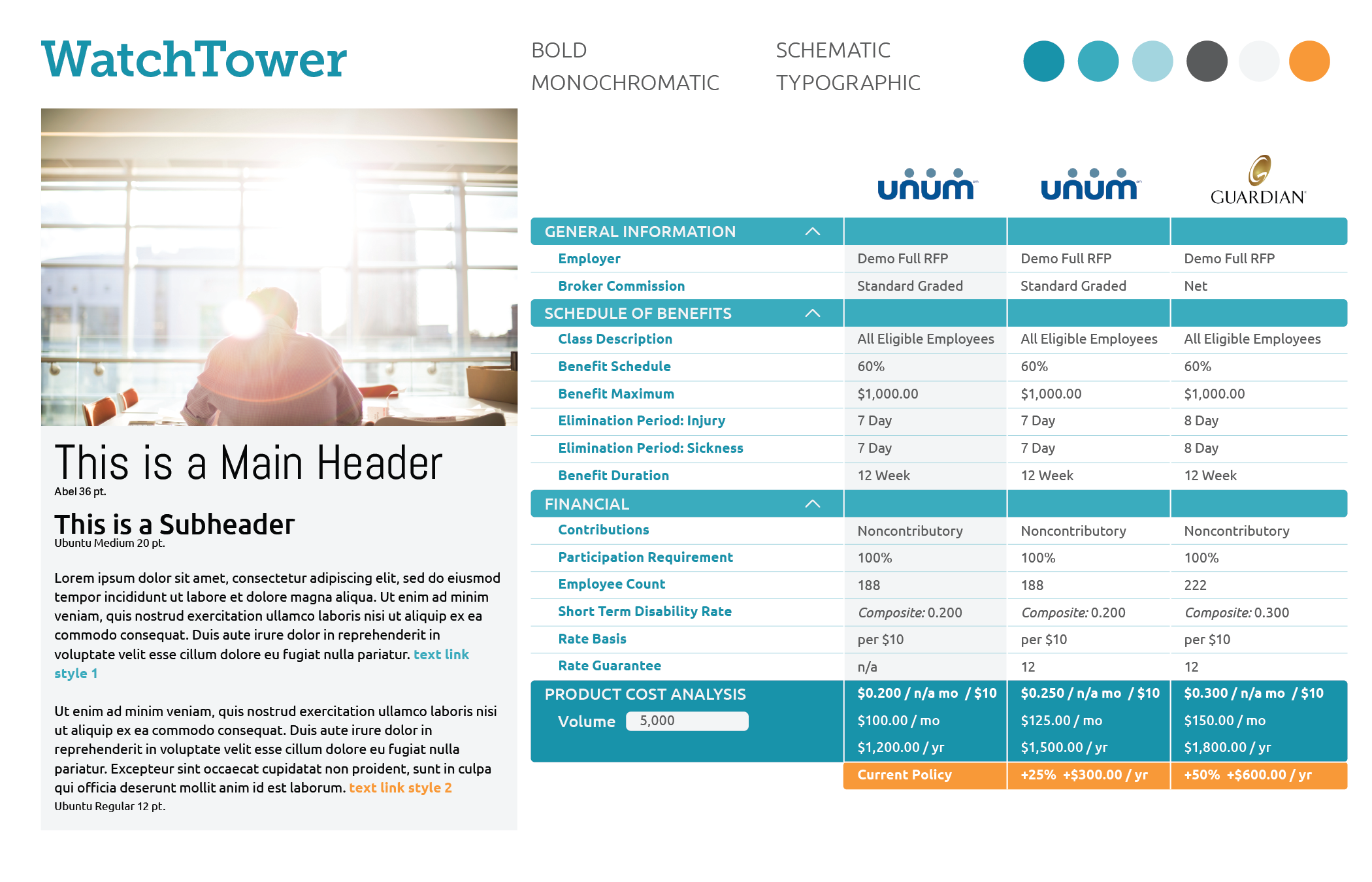
My tiles varied in feel from user-friendly and inviting to tech-focused, data-driven, and serious. In what is essentially styling data tables, there is a surprising and satisfying diversity in potential approaches. Bright color was a stated goal of the WatchTower team as well.

The WatchTower team was very engaged during the design process and had a very clear vision for their platform.

They offered well-considered and detailed feedback on all of our stylistic choices, so our individual directions were clear when proceeding to high fidelity screen designs.
Final Design Solutions
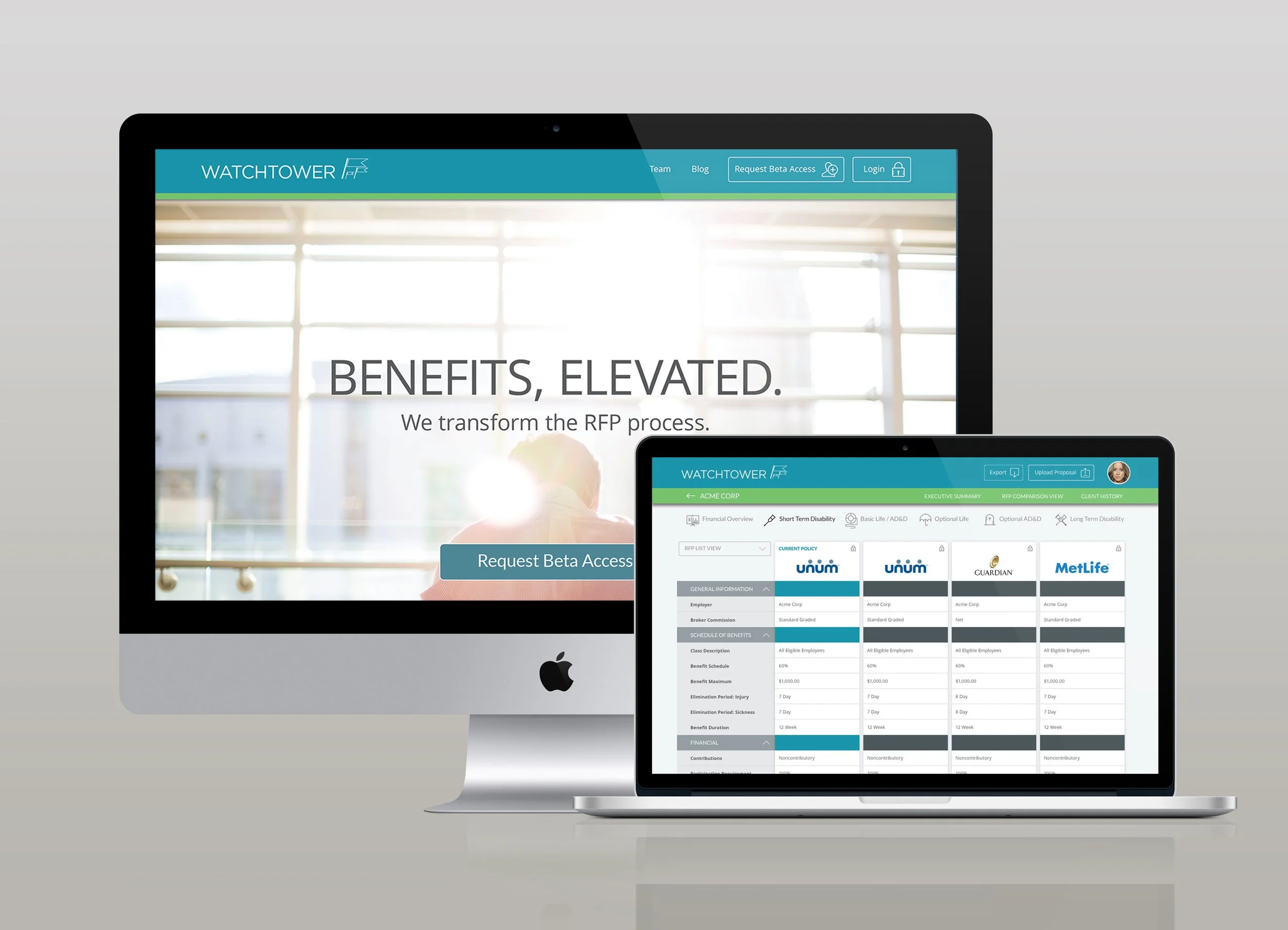
Desktop App Screens
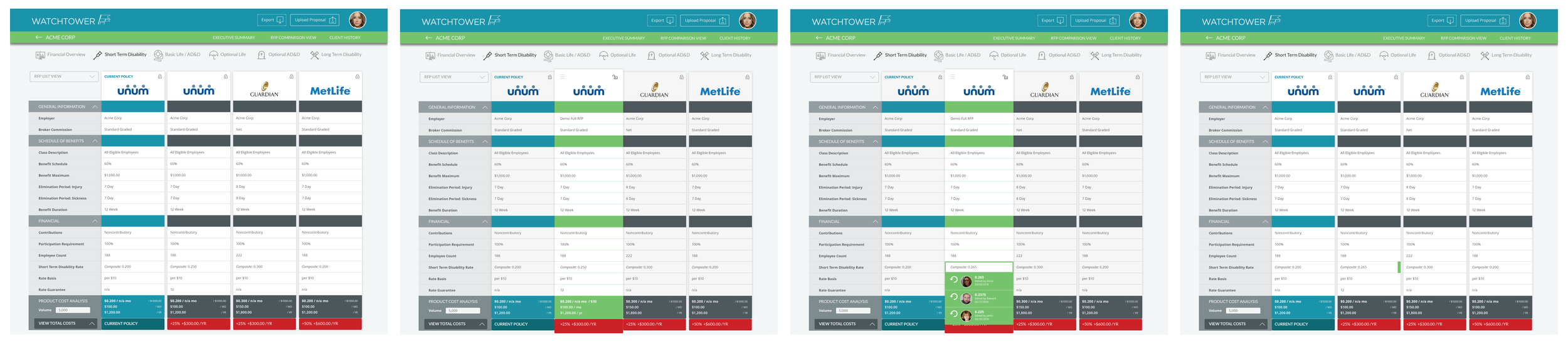
Working from the recently completed annotated wireframes, my final high fidelity designs leverage the tile design pattern and a bright, friendly color palette. The user (insurance brokers) will often need to access data from up to 12 different RFPs, necessitating working with a pair of conventional desktop monitors.
By collapsing, expanding, and reordering RFP columns as needed, the user can more easily access necessary information. Comparing in two separate RFPs can now be done side-by-side, regardless of the column’s original onscreen position.

Screens & One-Page Promotional Site Design
In addition to high fidelity platform screens, we were also tasked with designing a single-page promotional site for WatchTower. Again the WatchTower team was very clear-eyed in their vision for the promotional site, naming several favorite sites to emulate.
Allowing blue-green to dominate the design, the site clearly communicates accessibility and ease-of-use.
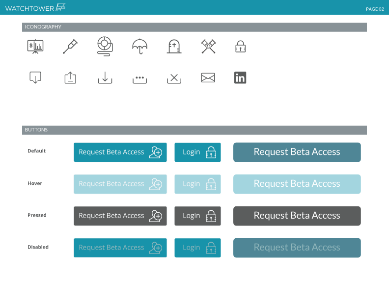
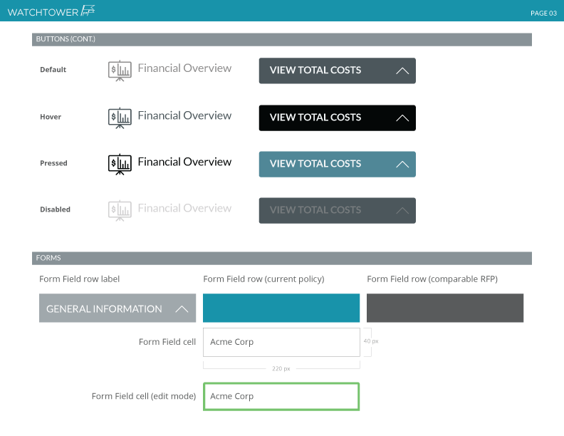
Style Guide
In addition to high fidelity platform screens, we were also tasked with designing a single-page promotional site for WatchTower. Again the WatchTower team was very clear-eyed in their vision for the promotional site, naming several favorite sites to emulate.


Allowing blue-green to dominate the design, the site clearly communicates accessibility and ease-of-use.
This final deliverable serves as a useful working document for the WatchTower team as they restyle the app.