UX Case Study
Zelle®
Zelle is a US-based digital payments network owned by Early Warning Services, a private financial services company.
Introduction
Through the Zelle network (owned by the US-based banks Bank of America, BB&T, Capital One, JPMorgan Chase, PNC Bank, US Bank, Citibank and Wells Fargo), enrolled users can send and receive money directly in and out of their registered bank account. Thanks to the collective cooperation of the aforementioned owner banks (and over one hundred participant financial institutions), transfers between registered users is typically completed in mere minutes. Transfers to pre-enrolled recipients can take between 1 and 3 business days after recipient enrollment.
Unlike principle P2P competitors Venmo and PayPal, Zelle doesn’t hold funds in essentially third-party escrow. The money is in the user’s bank account and is usable immediately, not just within a P2P ecosystem. Money sent with PayPal is deposited in the recipient’s PayPal account, immediately usable only in another PayPal transaction. Transferring PayPal funds to a user’s bank account can take up to five business days, when avoiding a withdrawal fee. Seen through the lens of funds availability, Zelle has a clear advantage.
EWS has very clear guidelines and instructions around the Zelle brand and user experience. Participating financial institutions are required to adhere to these documented guidelines and instructions for integrating Zelle into their existing banking apps.
Capital One’s Zelle experience satisfied basic functional criteria for a time, but had fallen out of compliance. As the Zelle network grows, new use cases are identified by EWS and incorporated into their guidelines. Participating banks are expected to keep pace with these mandated updates.
Through a reiterative certification process, banks work with both design and tech teams at EWS to ensure participant compliance. As the lead designer on Zelle at Capital One, I was directly involved in the reiterative design process. I was able to apply my UX and UI expertise to successfully negotiate (and often reconcile) two mature design systems to bring the Zelle experience at Capital One into EWS compliance. And guide the way for a more fully integrated Zelle experience with multiple touchpoints in the Capital One app experience.
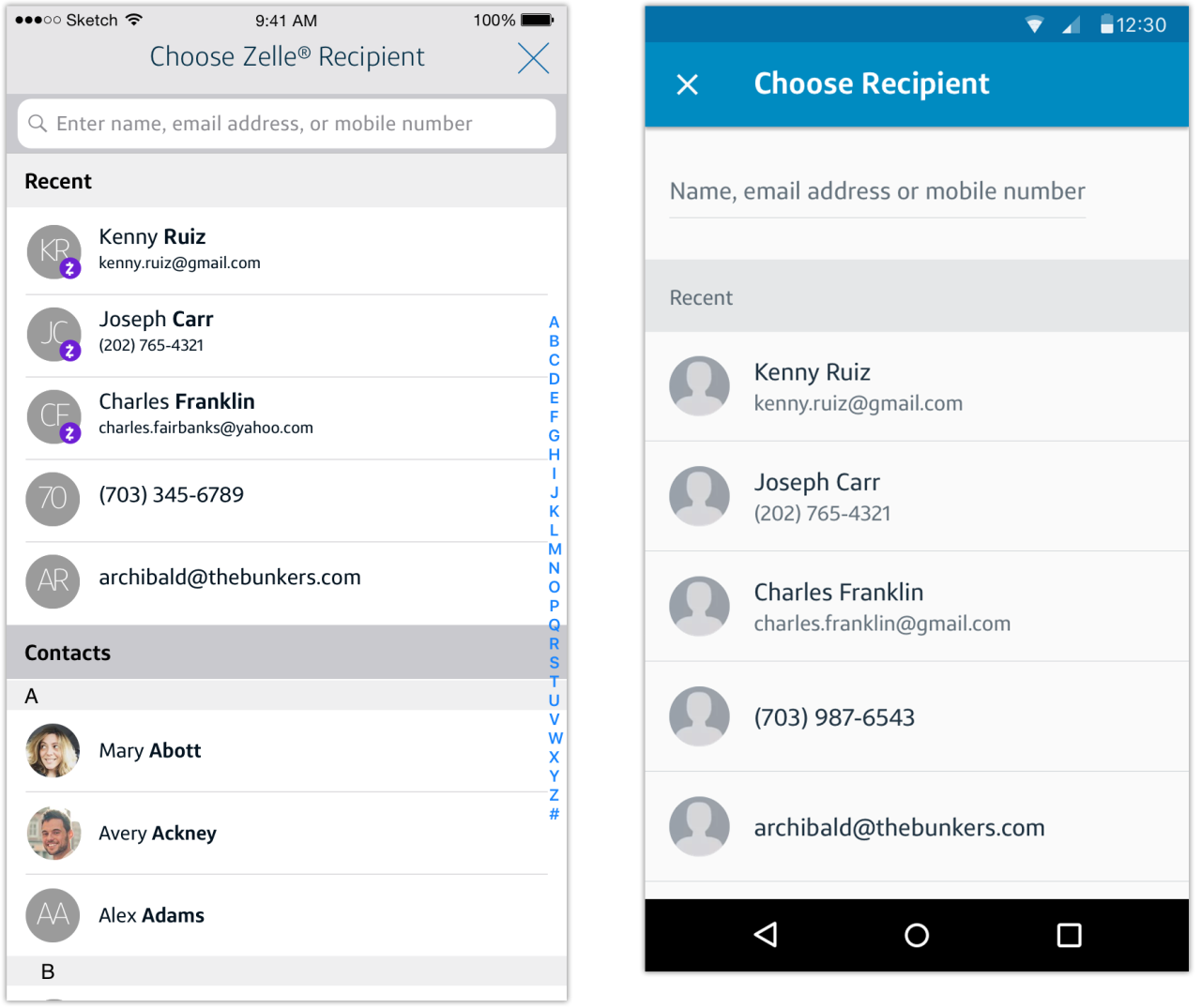
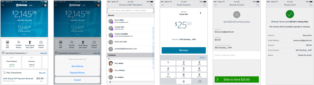
Recent Contacts
Prompted by customer frustration (according to Capital One call center data) with manually entering Zelle recipient contact information (email or mobile number) each time s/he wants to send or request money with Zelle, we needed to allow customers to see recent recipients.
Problem Statement
As a Zelle user, I want to be able to see recent recipients to make it easier to send them money again.
Ideation
The solution was to leverage native address book functionality (iOS and Android) to display the five most recent Zelle recipients when the customer selects either Send Money or Request Money from their account landing screen in the Capital One app.
In service of transparency, the Zelle-registered name of the recipient is displayed with the recipient’s registered email address or mobile number (in Zelle parlance, this is a ‘token’).
Pre-registered recipients display the email address or mobile number only as they are unknown recipients in the Zelle network and therefore do not have a token owner displayed. The ‘ownerless’ token display implies that the transaction is currently incomplete; money has been sent (or requested) but the pre-registered recipient has not yet taken action to receive or respond.
Final Result
Putting Recent Zelle Contacts into production has resulted in a decrease in user errors by 2000 monthly and a marked increase in customer satisfaction with Send/Request flows.
The feature has real benefit for Capital One in the significant reduction in calls and substantial cost savings (as their US-based call centers are high-cost), future iterations can have even greater transparency so the customer can make better-informed decisions around sending money with Zelle.
Understanding User (Empathize & Design)
Re-entering data needlessly is a customer frustration. Through internal informal research and review of external user feedback channels, we were able to verify this was a problem for our customers.
Mid Fidelity
Because native Address Book functionality was leveraged, we were able to move directly to mid-fidelity concepts in Sketch. And the product team was confident in the solution; no testing was done prior to the new feature going into production.
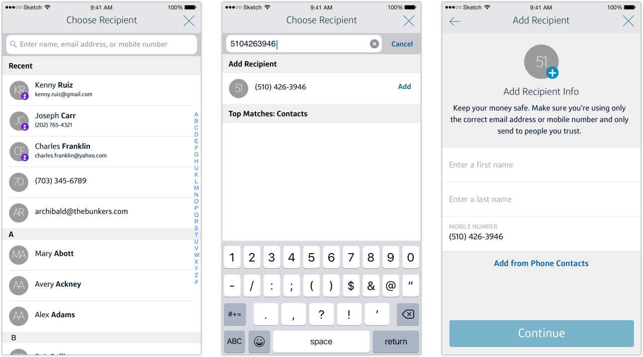
Building Capital One Address Book
Building on the foundation of Zelle Recent Contacts as the first true iteration of address book functionality in production, we moved quickly to closely align our experience with UI for the Capital One Address Book (as part of the larger Common Flow project, a conceptual re-imagining of Capital One app payments that directly addresses feature discoverability and removes rails for various payment methods).
Problem Statement
As a Capital One customer, I want to (be able to easily) add Zelle recipients to my Address Book (to make it easier to send them money again).
Final Result
Enhancing Recent Zelle Contacts with greater Address Book functionality successfully introduces the customer to this important Common Flow feature.
At time of execution, the Capital One Address Book was in its earliest stages, pioneered by this Zelle feature. Through organically-created Address Book contacts, the foundation is there for more functionality, including transaction history and the ability to repeat a send or request in the same or edited amounts, set up recurring Zelle transactions, and manually edit contact data.
Ideation
Both Send & Request flows launch the Choose Recipient screen, where Recent Contacts are displayed. (A successfully completed Send or Request flow automatically creates an Address Book entry, badged as Zelle-registered).
The search field doubles as an entry field when a search returns no results. Any name, email, or mobile number that doesn’t return a match in the Address Book prompts the user to create a new entry. The Add Recipient screen pre-populates with the user-entered data (or allows user to import from local phone contacts).
Understanding User (Empathize & Design)
Providing a name when manually entering an email address or mobile number is now required per Zelle UI guidelines: “Once the Sender sends the Payment to the [unknown] Recipient, the Recipient should appear in the Sender’s recipient list on the Select Recipient Screen.”
Similar to native Address Book (Android) and Contacts (iOS) functionality, the Capital One Address Book stores contact and payment information about every payee the customer interacts with, both businesses and individuals. Additionally, each Address Book entry will eventually display full payment history, making repeat or recurring payments easier to send.
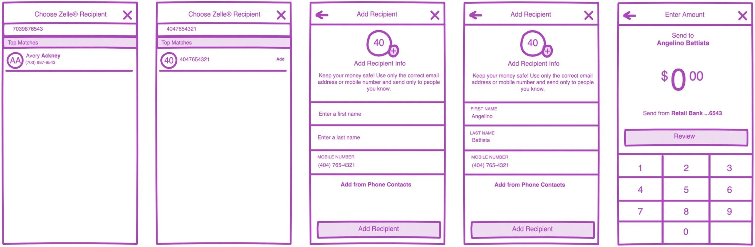
Low Fidelity
With native Address Book functionality serving as a design template, we were able to move quickly through low-fidelity concepts in InDesign Freehand to high-fidelity flows in Sketch.
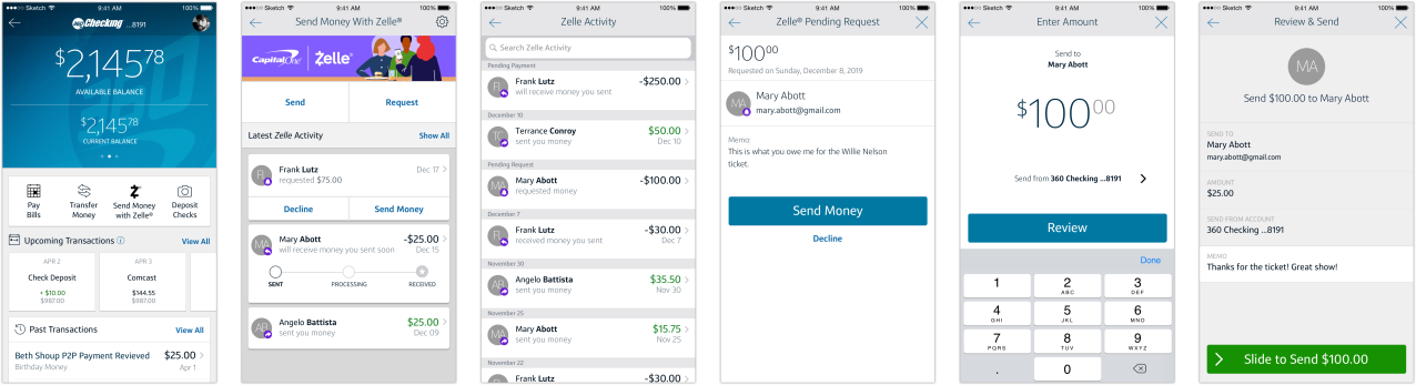
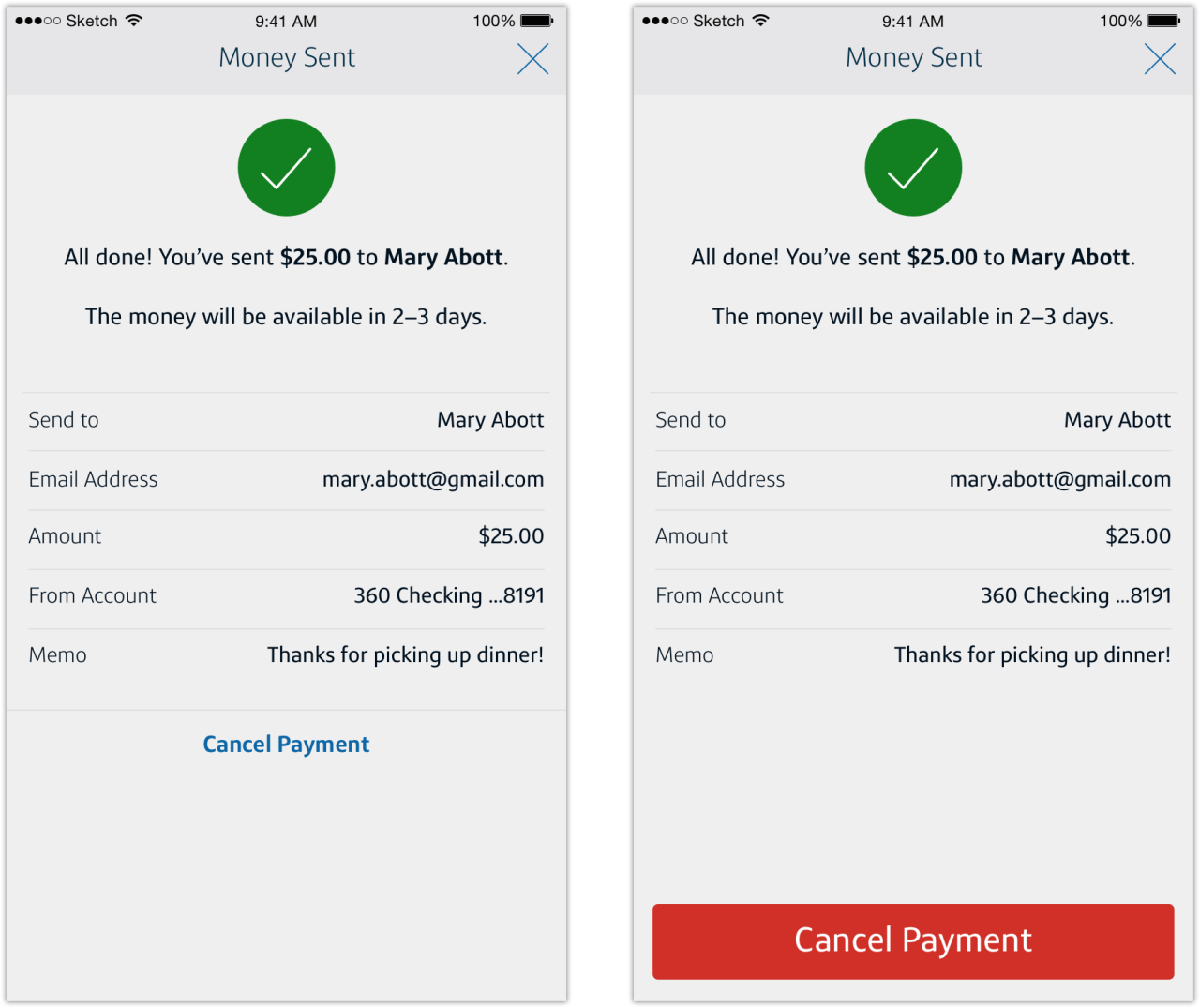
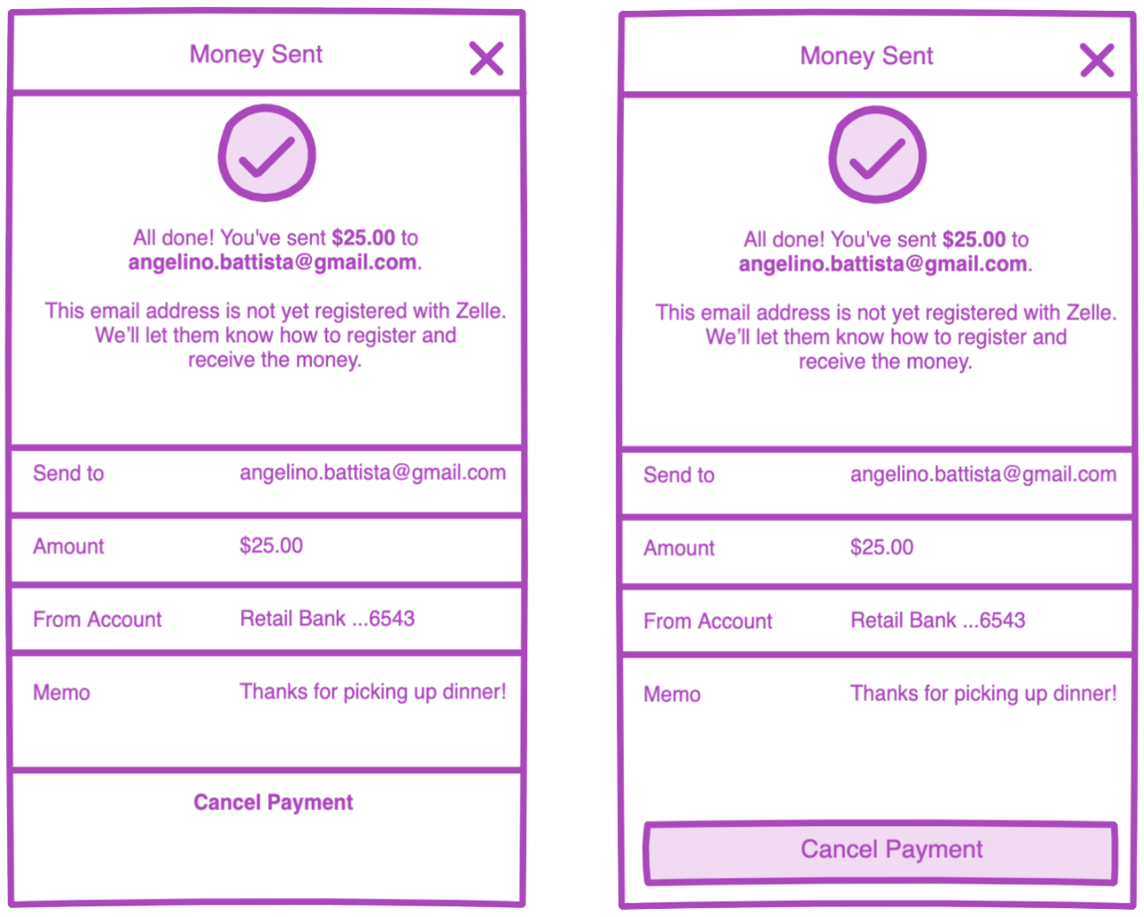
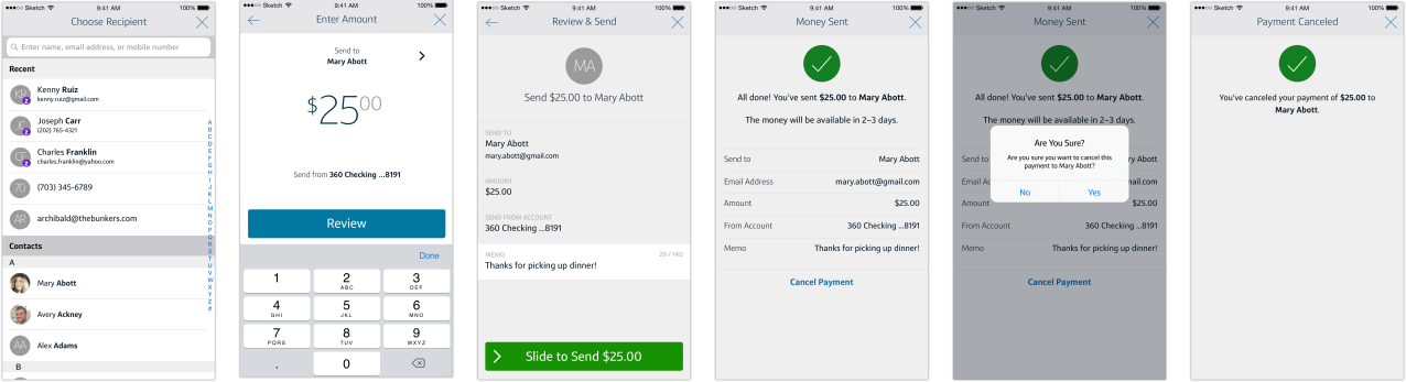
Cancel Zelle Payment
Prompted by customer frustration with any unanticipated payment delay (first time payment or unregistered token can delay payment 3 to 5 business days) only after he/she completes the transaction. Since the customer expects payment to be delivered per the value proposition of Zelle (“a fast, safe and easy way to send money in minutes”), providing the customer with the ability to cancel the transaction can address this frustration (and lower call center volume).
Problem Statement
As a Zelle user, I want to be able to cancel a transaction within the app when payment is delayed.
Final Result
Providing the customer with the ability to cancel a payment on the Confirmation page has resulted in improved clarity around Zelle transaction status empowering the customer to cancel without associate intervention, significantly reducing Zelle call center volume.
The feature has real benefit for Capital One in the significant reduction in calls and substantial cost savings (as their US-based call centers are high-cost). Future iterations can have even greater transparency so the customer can make better-informed decisions around sending money with Zelle.
Ideation
Thinking through approaches to the user action on the Confirmation page–text-based or button–the text-based Cancel This Payment call-to-action is the best option. The optional user action is clear but doesn’t dominate the screen like the standard button. Additionally, Capital One design principles do not allow for a button-based CTA on Confirmation screens (as it communicates to the user that additional action is required to complete the flow–definitely not the case here).
Understanding User (Empathize & Design)
Customer frustration with the delayed payment use case in the Send Money flow can be directly linked to high call center volume, as the customer has no other method for canceling said payment. While transparency around delivery times in-flow (prior to completion) is the ideal use case, it requires a heavier tech lift. Canceling right on the Confirmation page (prior to any electronic funds transfer) largely addresses this problem. Providing the customer the mechanism to both understand the reason for the delay and cancel the transaction without relying on a conversation with a call center associate.
Low Fidelity
Because Product has the ability to cancel a delayed transaction, we only needed to iterate on Confirmation page views. A brief description of the use case explaining the delay in the subtext and a ‘Cancel This Payment’ CTA makes clear the course of action the customer can take.
Mid-fidelity prototypes were tested internally to validate our proposed solution.
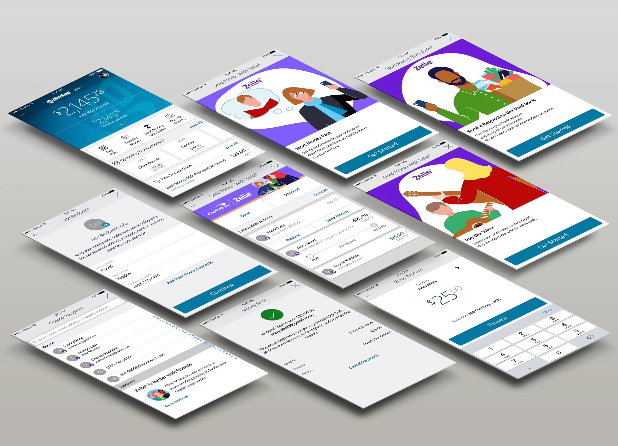
Zelle Onboarding
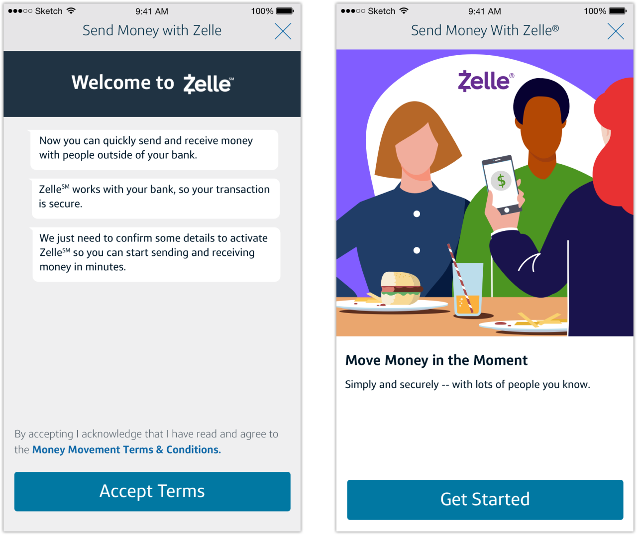
To comply with EWS Zelle UI Guidelines, Zelle network participants are required to incorporate onboarding in the enrollment flow. Only the primary screen of their four screen enrollment carousel is required:
The first ‘Get Started’ screen of the Enrollment flow is an important Brand moment for Zelle. It is required that the first screen in the Enrollment flow clearly answers [the] user’s question ‘What is Zelle?’.
Problem Statement
As a Capital One customer, I want to understand what Zelle is and what its benefits are as a payment method.
Ideation
Ideation gave me the opportunity to leverage illustration skills. Manipulating the existing vector-based illustrations and adding additional elements, I put together a three-person dining scene that brings the mandated “Move Money in the Moment” copy to life. The only noteworthy difference being that while Zelle recommends “authentic facial expressions” in photography, the Capital One character set is deliberately expressionless (more to emphasize archetypes than distinct personalities).
I iterated on additional illustrations for the three secondary “Get Started” screens, which are variations on the value proposition and additional use cases for sending money with Zelle. I also wrote new copy to provide a deeper understanding of the Zelle experience and elucidate on safety, transparency, and funds availability.
Final Result
The onboarding imagery answers the customer’s question, “What is Zelle?” and the introduction of color is a welcoming change within the Capital One app. It provides a friendly entry point into Zelle and remains true to Capital One design principles.
Low Fidelity
Once I freehand sketched (lowercase f + s) a general concept, I moved directly to Adobe Illustrator to build the scene.
Move Money in the Moment
With lots of people you know.Pay the Sitter
Staying out a little later on date night?
Skip the trip to the ATM for extra cash.Send Money Fast
Safely send money to your undergrad
Direct from your bank account to theirs
in just a few taps.Send a Request to Get Paid Back
Directly into your bank account
and ready to use in minutes.
No third party apps or intermediary accounts.

Additional thoughts around increased awareness and engagement with the Zelle experience involved feature marketing. I explored leveraging illustrated marketing tiles on the customer’s eligible account page. The mid-fidelity tiles above are a compelling, high-profile entry point into Zelle for the pre-enrolled customer.
Understanding User (Empathize & Design)
With the single required screen, EWS recommends using photography with the following stylistic guidelines:
Conveys energy, movement and being in the moment.
Tells stories in ways that are arresting and fresh, sometimes a little irreverent.
Uses a range of subjects from people to objects and environments.
Includes people with authentic facial expressions, not just smiles.
Features dynamic angles and crops.
However, Capital One branding guidelines do not accommodate photography in the app experience. So we leveraged the Capital One illustrated character set instead.


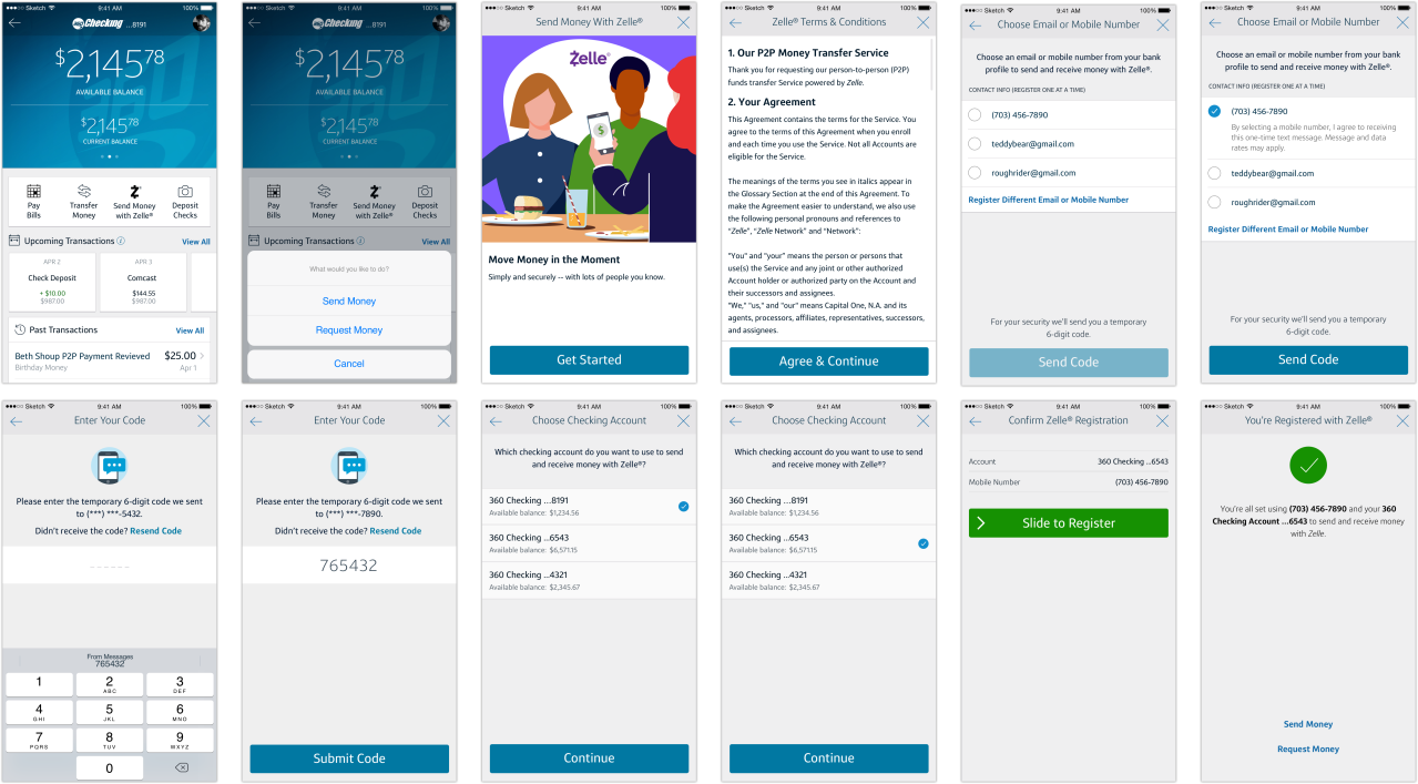
Zelle Enrollment Flow
Onboarding is an important Brand moment for Zelle, as it represents the entry point for engagement with the product experience. Satisfying the requirement to clearly answer the user’s question “What is Zelle?”, the user is then guided through the enrollment process.
The enrollment flow appears the first time a user opens the “Send Money with Zelle®” CTA within Participant App. During this flow the user is educated about the service offerings of Zelle and how it is a fully integrated experience within the Participant App, followed by setting up preferences. The Enrollment flows and steps are required use cases. Each Participant has flexibility to add additional information needed for compliance, security and verification from the user.
Problem Statement
As a Capital One customer, I want to be able to easily enroll with Zelle.
Understanding User (Empathize & Design)
The existing enrollment flow required significant iteration on multiple use cases to bring it into compliance with EWS UX guidelines, while adhering to Capital One design principles.
Final Result
Providing the customer with a better enrollment flow leads to greater clarity throughout the enrollment process, leading to significant gains in completion rates.
While Zelle is easy to use and provides great feature value to the customer, the Zelle enrollment process is complex, containing multiple steps and options. The ‘one screen, one action’ mandate for enrollment provides clarity at each step, but creates multiple steps, increasing the cognitive load on the customer and leading to lower completion rates.
A simplification of the enrollment process that is single-screen and use case specific (ex: limiting enrollment to the originating account, surfacing latest- or most-used token as default) would yield much higher completion rates.
Mid and High Fidelity
Ideation
Improvements included:
Replacing the previously-mandated “Welcome to Zelle®” ‘chat’ bubbles (ostensibly to emphasize the ‘money with friends’ brand asset) with the onboarding screen
Clear page titles that describe the action(s) to be taken in the enrollment flow
Clearer Terms & Conditions
Clarity around selecting a contact point (email address or mobile number) from the customer’s Capital One profile to register with Zelle OR registering a different [manually-entered] contact point
Elimination of multiple modal windows (per EWS guidelines)
Clarity around the OTP security measure in enrollment
Clarity around Zelle-eligible account selection
Clarity around pending payment(s), including sender, date, and amount, to help the customer make the best-informed decisions around prioritizing payments
The EWS-identified enrollment use cases include:
Organic enrollment
Organic enrollment with pending payment
Organic enrollment with multiple pending payments – multiple tokens
Organic enrollment with pending payment request
Organic enrollment with multiple pending payment requests – multiple tokens
As Capital One has elected to not surface pending requests, the final two EWS-identified use cases do not apply. So the organic enrollment flow covers only the pending payment use cases.
Enrollment was already in production and changes were made largely to bring the Capital One’s Zelle experience into compliance. Explorations were made at mid- and high-fidelity using Capital One’s enterprise-level One Design UI kits. Informal testing was conducted internally for flow and messaging clarity.

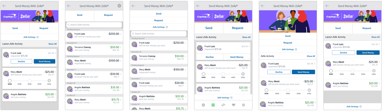
Zelle Landing Page
EWS UX guidelines require a Zelle landing screen when entering any Zelle flow. This landing screen contains five discrete elements of Zelle functionality: Settings, Send, Request, Split, and Activity. In the Capital One app, the CTA Send Money with Zelle® appears in the extensibility (navigation) bar on the account screen. However, appetite for Split functionality is low (EWS data suggests that customer engagement with Split is relatively low when compared to Send and Request).
Problem Statement
As a Capital One customer and a Zelle user, I want a clear and actionable Zelle hub.
Understanding User (Empathize & Design)
While Capital One had previously addressed the dual pathways of Send and Request with an Action Sheet (iOS) or Overflow Menu (Android), it became clear that organizing additional features couldn’t simply be achieved by adding new menu items. The menus don’t accommodate a clear hierarchy (save for sorting order) and discoverability of Zelle features remains challenging for the Capital One customer.
Rather than strictly following the mandate and keeping with Capital One design principles, we elected for a more actionable hub instead of a Zelle landing.
Mid and High Fidelity

Ideation
The design leverages the brand-appropriate purple in a more thoughtful way through a small banner illustration that still engages and delights, despite its reduced size. It also remains consistent with onboarding illustrations. The pairing of the Capital One logo with the Zelle logo is a clearer cobranding effort. We’ve reduced the size of the Send and Request buttons without reducing visibility. Settings leverage the more recognizable gear icon The hub includes all the required elements but adapts the C1 design pattern for the transaction ledger (as seen on the account screen) where the customer can see recent Zelle transactions and take immediate action on a pending request.
I iterated on multiple layout options at mid-fidelity in Sketch before executing at higher fidelity for testing.
Testing
We tested several landing page layout options for clarity. We also tested findability against the current experience in production (described above) and found a marked improvement among the test subjects.
Final Result
The Zelle landing page addresses both the UX requirement and adheres to Capital One design principles resulting in:
improved findability of send and request flows, Zelle settings, and transactions
empowering the customer to take immediate action on a pending transaction
The biggest takeaway which was common among all testers was that The “Send Money with Zelle®” CTA continues to confuse users on non-send money activities. The CTA is a protected brand asset but in an ecosystem where every CTA is literal and directly communicates intent to the user, “Send Money With Zelle®” encompasses only the flow it describes. Moving forward, explorations of different, broader, less specific CTA language could lead to better clarity for the user.